The rules of heading tags and how to optimize your tags today
I know how easy it is as an entrepreneur to get lost in the design, content, and SEO of building your website.
Whether you’re a perfectionist or not (I’m not), your website is a perpetually unfinished project that sucks you in. I, too, have spent hours adjusting the design and content of a single section on a page.
So today I’m going to talk about another small section of your website – header tags, their purpose, and why they’re an extremely important and often overlooked aspect of SEO. Header tags.
If you’re here, you already know how important SEO is and you’re doing your best to DIY it. DIYing must be a toxic trait for us entrepreneurs.
So let’s get into the wild and exciting world of header tag SEO.
The purpose of heading tags

The purpose of heading tags is twofold: to guide your visitors easily and clearly through your website while also serving the purpose of structuring your site to showcase what you consider to be the main and important pieces.
- This is why you should only have one H1 heading per page
- You should not duplicate H1 headers on different pages
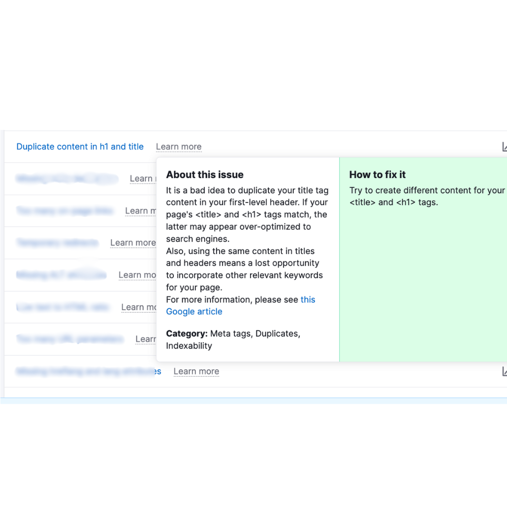
- You should not use the same H1 for your SEO title
- And why you need to use H2, H3, & H4 headers throughout the copy
No biggie! I’m going to cover all of that in more depth in this post.
Website header tags are more than an aesthetic choice
I will never lie to you. When I was starting my business I DIY’d my website on Squarespace and I used heading tags for aesthetic purposes. Mostly for sizing.
I had obviously written fantastic copy and I wanted the design to reflect that. So imagine my shock and surprise when I started learning more about SEO and the role that heading tags play in helping your site get found by the right people (and search engines). Woops!
That’s okay, we made it here, didn’t we?
Depending on the size of your website, going through every single heading tag can be tedious. But it’s extremely important!
I think we’ve learned the lesson time and time again that sometimes the smallest among us are powerful.
Adjusting your headers through copy, keywords, and tags is one way of optimizing your site for visitors (and Google).
The rules of header tags

Let’s dive deeper into how to properly use headings and heading tags on your website.
1. Use only ONE H1 heading per page
There are a few reasons H1 tags are so important for your website.
- H1 tags tell the Google bots crawling your website what is the most important piece of information on your site.
- An H1 tag “can show readers what they’ll learn before they dig in.” (SemRush) It helps to reassure visitors they’re in the right spot.
- H1 tags help guide users who are using screen readers through the page’s content.
To tell you how important an H1 heading is, I know someone who’s entire business is centered around helping people craft an H1 and opening statement for their site. The cost is $10,000.
- There should be only one H1 tag on each page
- It should be at/near the top
- It should not be your logo or business name
- It should contain the main keyword for your page
2. H1 headers should be unique from page to page
Do not duplicate H1 headers throughout your site. Yes, your website should feel like a cohesive package but each page should also be able to stand on its own. The content & SEO should support that.
Remember, your H1 is the most important part of the page for Google and visitors. Having the multiple pages with the same H1 headers would just be plain confusing for both. What you want to do instead is have primary and secondary keywords, kind of like synonyms that you use throughout various H1s.
3. SEO titles & H1 headers should be different (but similar)
An SEO title, or title tag (same thing), is the text that appears in the search results that someone would click on to go to the page. The H1 header is what appears inside the page, typically at the top as the “title”.
Title tags and H1 headers should not be identical otherwise it looks like you’re keyword stuffing or trying to manipulate the results and we don’t want that. Best practices include:
4. Include the other headers: H2, H3, & H4
I’ve been talking a lot about H1s which hopefully drives home how important they are, but what about H2-H4? The best way to think about headings and structuring your website is like a book report or outline. Chapters and subchapters.
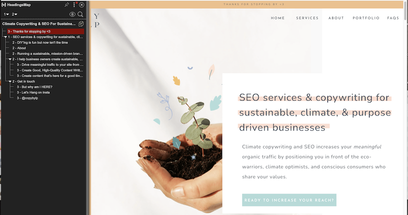
- H1 — main idea/concept for the page
- H2 — secondary topics/points (services you offer, pain points, why you do what you do, about)
- H3 — subpoints of the H2 (individual services, takeaways, benefits)
- H4 — subpoints of the H3
Headings are to help break up the copy so visitors aren’t faced with a block of text. They’re helpful for screen readers and for skimmers who don’t want to read every word.
For your keywords, don’t force them into every header because that will start to sound unnatural. Sprinkle them throughout the headings where it makes sense.
JUST FOLD IN THE CHEESE DAVID.
Copy guidelines for your website headers
Here’s where it gets really fun. You want your headers to flow with your website copy. You don’t want to focus only on the SEO and keywords making the copy choppy and uninviting. You have to merge the two, which I’ll be the first to admit can be difficult!
Look for topic shifts
Shifts in topics are natural spots to add headers. On your home page you’re going to have a few key points: the main block of text that captures the essence of what you do, a point speaking to your ideal client’s pain points and how you can help, diving deeper into how you can help, a section about how you got here/why you do this, how you can help, your services, etc etc.
All of these points are great places to add headers and their appropriate header tags. Instead of using basic terminology like ‘about’, ‘services’, ‘why I do this’, ‘how I can help you’ use sentences, add keywords, talk about pain points, and don’t be afraid to show a little personality.
Look for blocks of text that are too long
You want to avoid large blocks of text as much as possible. A paragraph should be no more than 3-4 sentences and a header should always be visible from any spot.
Thinking like this will help you naturally break up topics where you can add H3 & H4 headings. Start with the copy that’s already there and see if any of the sentences or transition sentences can be turned into an H3 or H4 heading. If not, look at the section and determine what you can add to help readers flow through.
Headers should help a reader flow through the content
When you’ve gone through and added your headings, go back and read only the headers. Do they help the copy along, do they make the reader want to move forward. If they feel bumpy or not cohesive, this is a good way to pull back and help them fit into the overall page.
Headers should help tell the whole story
Finally, read through the headers and see if they tell the whole story. If someone was only reading the headers would they have a basic understanding of what you do, what this page is for, and what they should do next? If not, adjust.
Add your keywords
You can add keywords at whatever stage you want. But I think it’s helpful to add them at the end to ensure you’re not trying to force them. Once you’ve ensured that everything flows and makes sense and creates a nice journey for a website visitor, see if there are any headers you can add keywords to in a natural way.
Again, every single header doesn’t need to have a keyword but try to have at least one H2 that contains a keyword and of course include them in the actual copy where needed.
How to fix and optimize your website headers TODAY

Okay so I’ve given you A LOT of information, there’s just so much nuance to SEO. So if you want to get started making changes to your website headers — and blog headers — today, here’s what you can do.
1. Identify the main keywords and sub-keywords for your website
2. Paste your current website/blog copy into a word doc and read through your copy from the perspective of a potential customer.
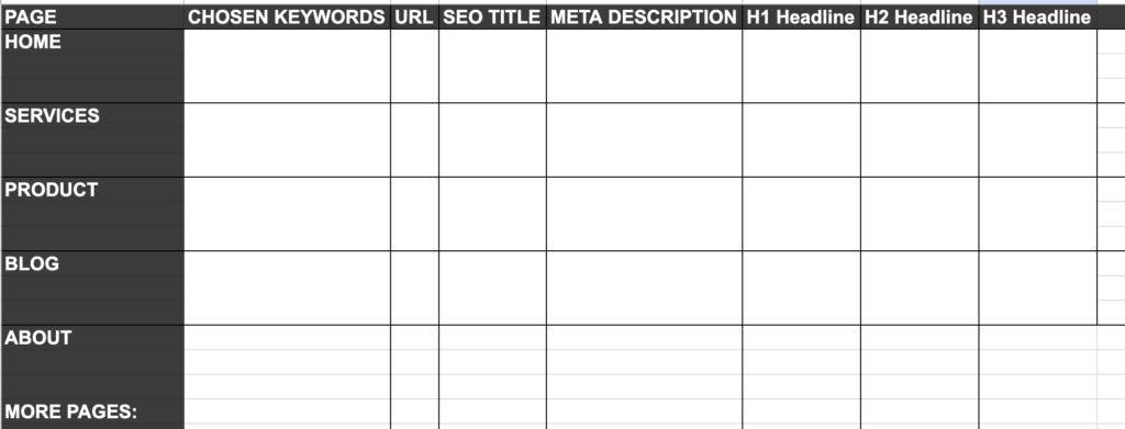
3. Start with H1 headers. I find it helpful to use a Google Sheet to map out each page’s header (image above).
- Ensure there is only one H1 per page.
- Ensure each page has a different keyword
4. Turn your attention to H2-H4. Skim through the headers and check for the following:
- Does it still make sense only reading the headers?
- Does it present a clear(ish) vision of what you do?
- Do visitors see their struggles reflected?
- Are your products/services and their next steps clear?
- Does at least one H2 contain a keyword?
- Are the headers formatted in order of importance? Do the H2’s present the main topics/ideas?
On platforms like Showit, adjusting the heading tag doesn’t change the presentation of your text which has its pros and cons. It’s great because you can have a longer H1 at the top of the page that doesn’t take up the entire top of the fold, but you have to remember to make H2s, H3s, and H4s smaller and change the formatting slightly to help with the presentation of the text.
On platforms like Squarespace, changing the heading tag will change the appearance of the text. That’s great because it naturally formats H1s to be larger and H4s to be smaller. But on the other hand you may have to do some extra editing once you plug it in because it looks wonky.
Alright peeps, I think that sums it up! If you made it through this, thank you! It took way longer to write than I thought. If you’re feeling fed up trying to DIY your SEO and stay up to date with it all, let’s chat.
Let’s chat SEO services & retainers!
You might also be interested in some of my other stuff…